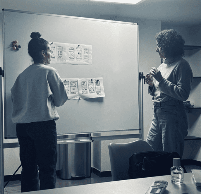
Sketches
We kicked off the design phase with manual sketches to materialize our initial ideas before moving to high-fidelity prototyping in Figma.
We kicked off the design phase with manual sketches to materialize our initial ideas before moving to high-fidelity prototyping in Figma.

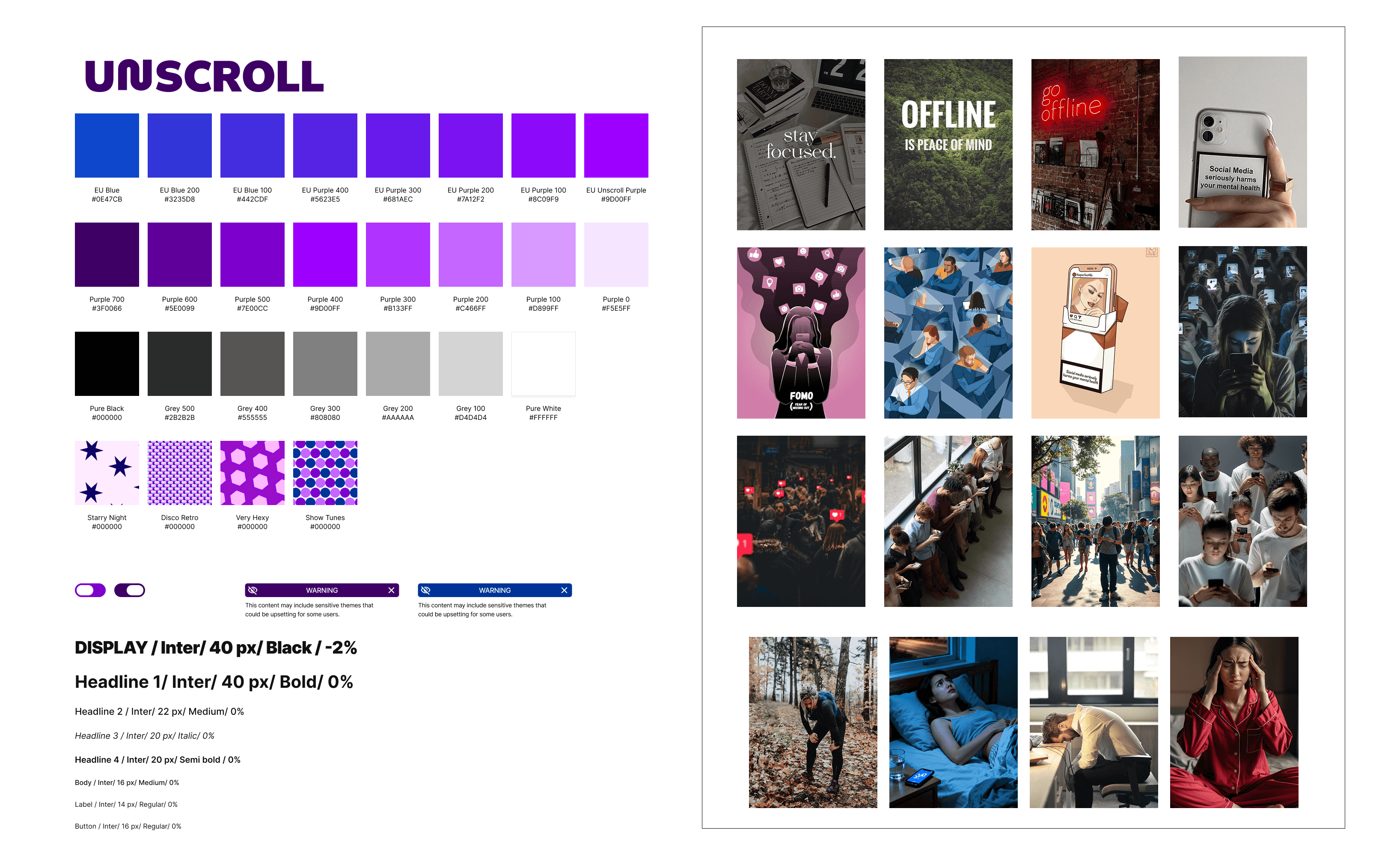
Moodboard
Defining the visual identity was a process of discovery. Before consolidating a Style Guide, we decided to explore creative directions through individual Moodboards. This stage was essential for aligning our visions on typography, color palettes, and iconography, serving as the visual foundation for the product's development.
Defining the visual identity was a process of discovery. Before consolidating a Style Guide, we decided to explore creative directions through individual Moodboards. This stage was essential for aligning our visions on typography, color palettes, and iconography, serving as the visual foundation for the product's development.
I began the moodboard by exploring color symbolism, selecting purple for its global connection to addiction recovery. I developed a range of shades to expand our design possibilities. During the typography phase, I tested some options, and we ultimately choose Inter for the final prototype due to its neutrality and clear legibility. I completed the composition by curating icons and ironic imagery that were relevant to the theme of social media addiction.
I began the moodboard by exploring color symbolism, selecting purple for its global connection to addiction recovery. I developed a range of shades to expand our design possibilities. During the typography phase, I tested some options, and we ultimately choose Inter for the final prototype due to its neutrality and clear legibility. I completed the composition by curating icons and ironic imagery that were relevant to the theme of social media addiction.

Style Guide
After exploring our individual moodboards, we consolidated the best references to define the project's visual direction. We aligned typography, colors, and iconography to ensure a cohesive interface. The Style Guide evolved throughout the process, and this was our final result:
After exploring our individual moodboards, we consolidated the best references to define the project's visual direction. We aligned typography, colors, and iconography to ensure a cohesive interface. The Style Guide evolved throughout the process, and this was our final result:
Prototype
With the visual identity defined and our strategy consolidated, we moved into the prototyping phase. First, we developed a high-fidelity replication of Instagram's interface to serve as the foundation for our interventions. We then integrated the Unscroll flows and refined some details. I added a video of the prototype with some of the interventions below, but you can check the prototype on Figma by clicking here.
With the visual identity defined and our strategy consolidated, we moved into the prototyping phase. First, we developed a high-fidelity replication of Instagram's interface to serve as the foundation for our interventions. We then integrated the Unscroll flows and refined some details. I added a video of the prototype with some of the interventions below, but you can check the prototype on Figma by clicking here.


5/7
Sketches
We kicked off the design phase with manual sketches to materialize our initial ideas before moving to high-fidelity prototyping in Figma.
Moodboard
Defining the visual identity was a process of discovery. Before consolidating a Style Guide, we decided to explore creative directions through individual Moodboards. This stage was essential for aligning our visions on typography, color palettes, and iconography, serving as the visual foundation for the product's development.
I began the moodboard by exploring color symbolism, selecting purple for its global connection to addiction recovery. I developed a range of shades to expand our design possibilities. During the typography phase, I tested some options, and we ultimately choose Inter for the final prototype due to its neutrality and clear legibility. I completed the composition by curating icons and ironic imagery that were relevant to the theme of social media addiction.
Style Guide
After exploring our individual moodboards, we consolidated the best references to define the project's visual direction. We aligned typography, colors, and iconography to ensure a cohesive interface. The Style Guide evolved throughout the process, and this was our final result:
Prototype
With the visual identity defined and our strategy consolidated, we moved into the prototyping phase. First, we developed a high-fidelity replication of Instagram's interface to serve as the foundation for our interventions. We then integrated the Unscroll flows and refined some details. I added a video of the prototype with some of the interventions below, but you can check the prototype on Figma by clicking here.

Unscroll: Ideate
Unscroll: Ideate
5/7